Editorial collection
brief: Design a series of six book covers belonging to a same collection, using each of the six types of contrasts:
colour in itself, complementary colours, warm-cold, light-dark, quantity and quality.
colour in itself, complementary colours, warm-cold, light-dark, quantity and quality.
The titles of the books are imposed, as is the format: 11cm x 18 cm.
This project was originally created a few years ago for a class project. Recently, I decided to re-work the entire project as a personal challenge. The colours, fonts and illustrations have been re-visited and the project now includes the full cover (front-spine-back) instead of only the front cover.
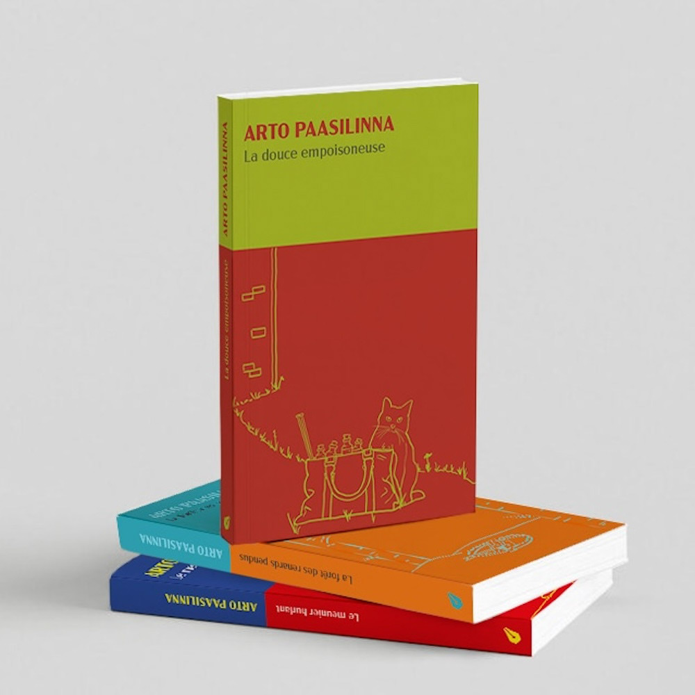
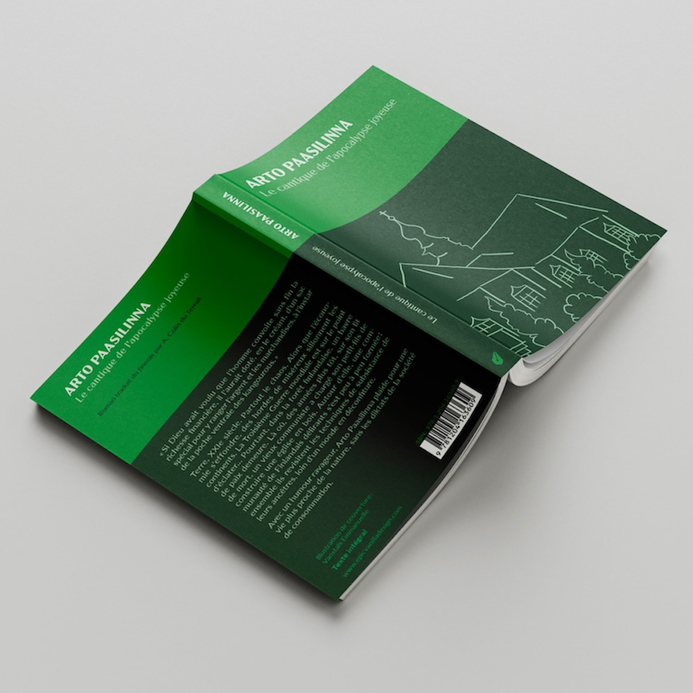
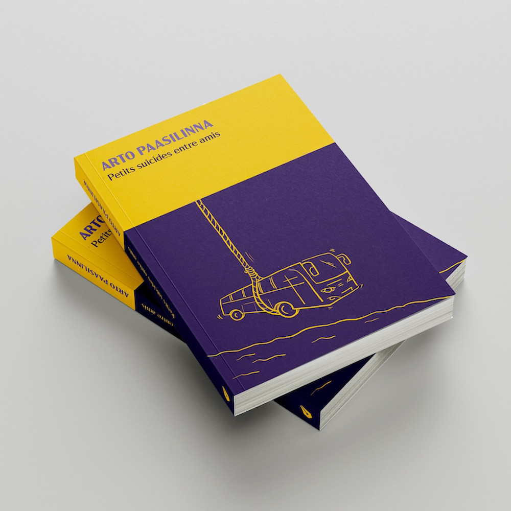
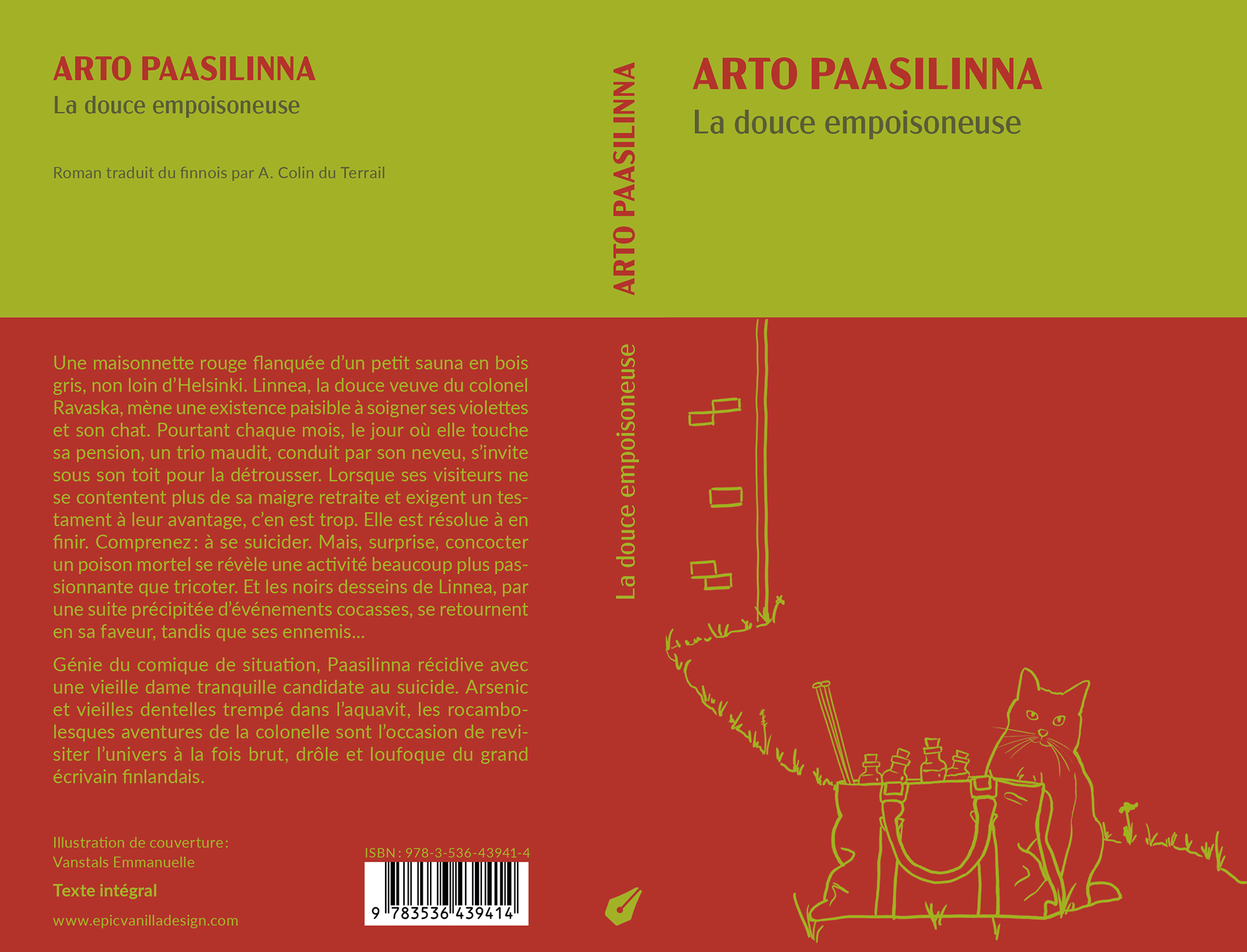
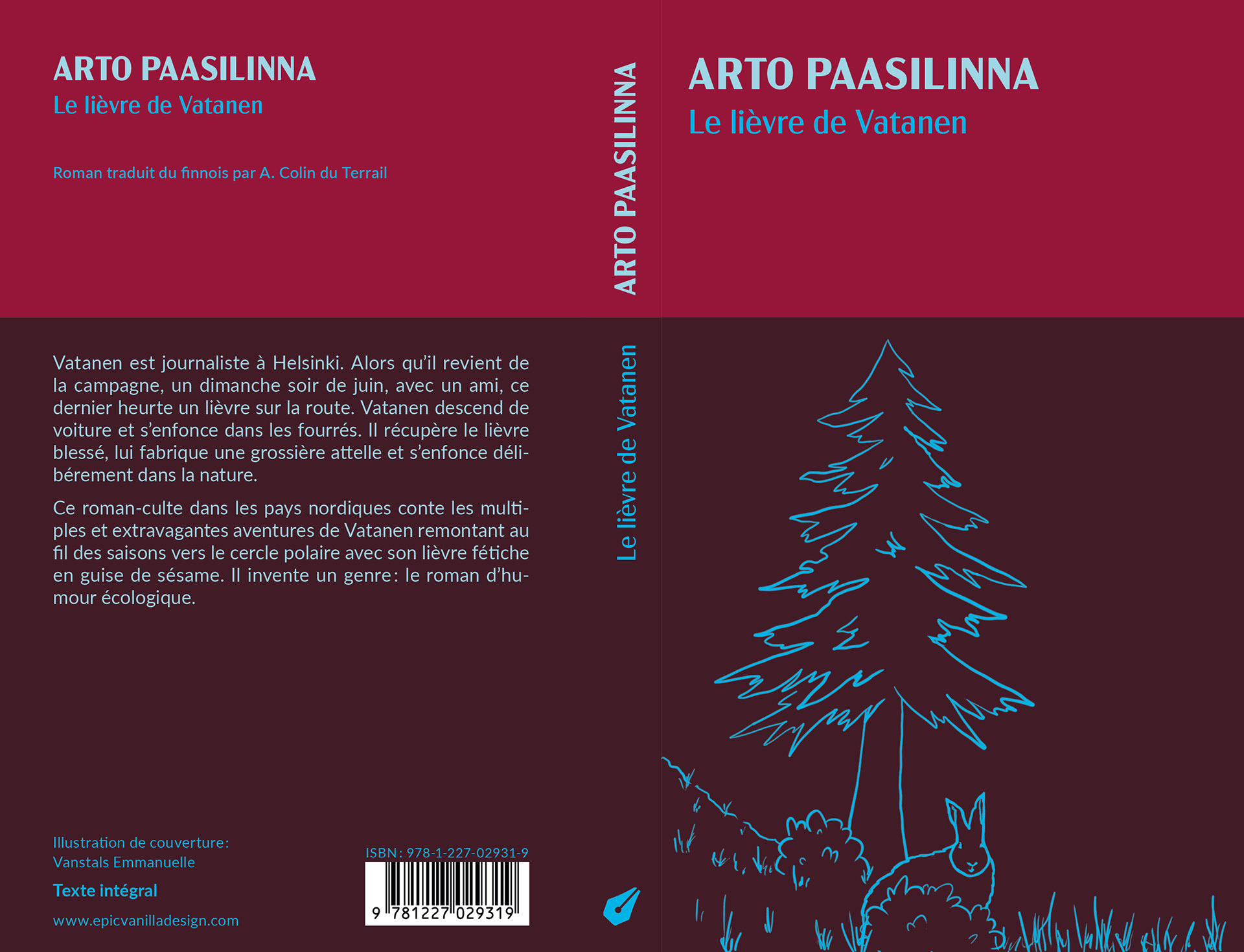
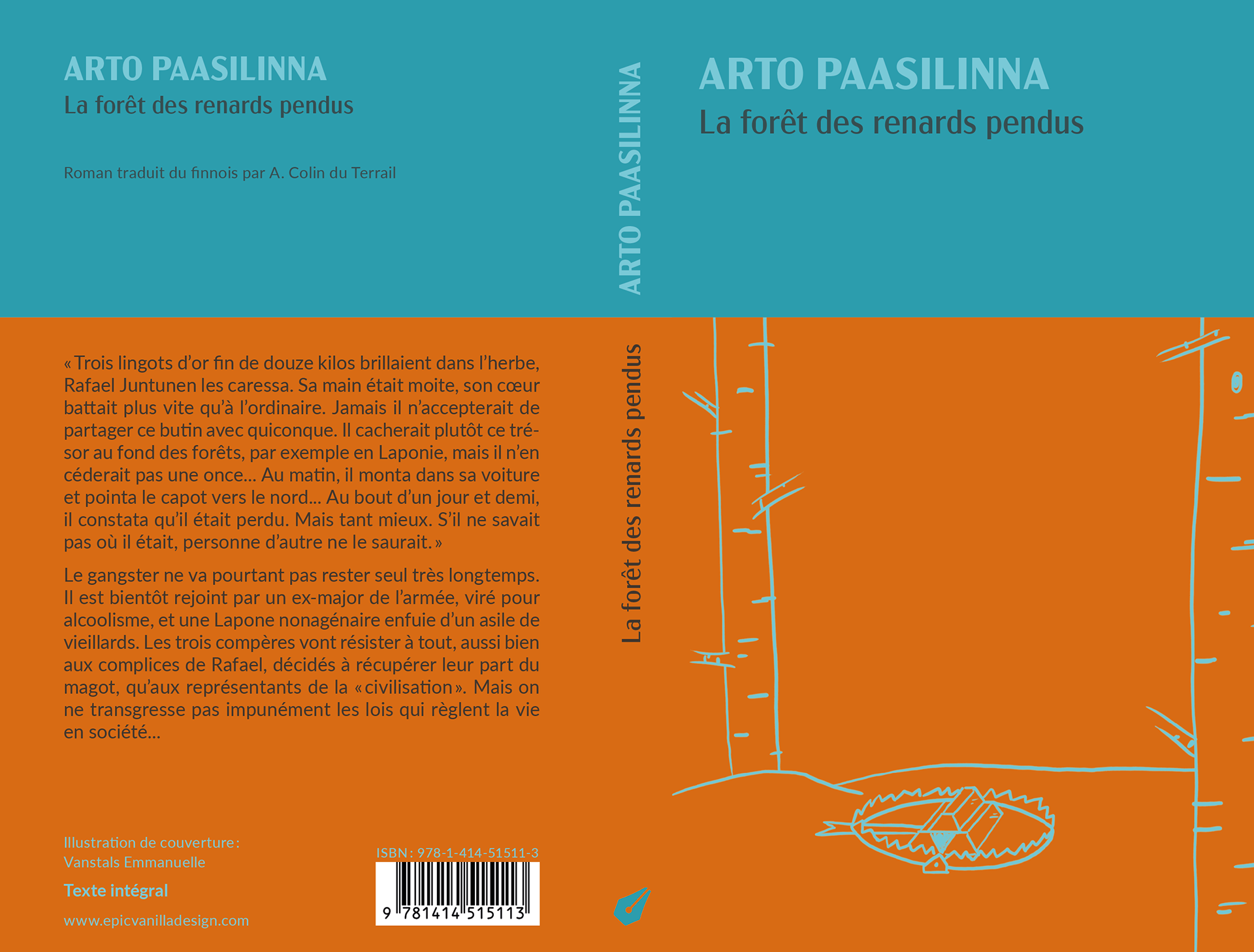
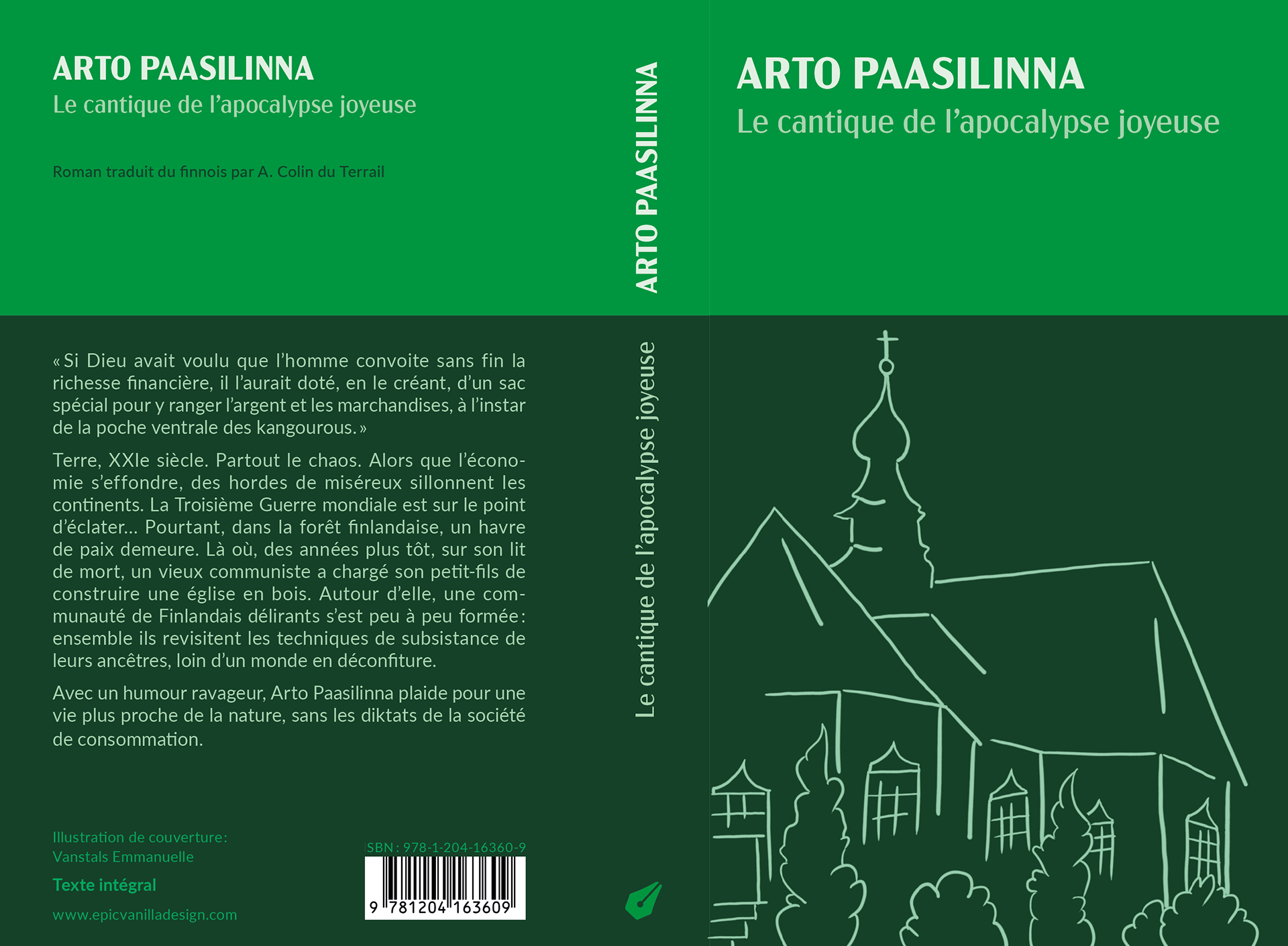

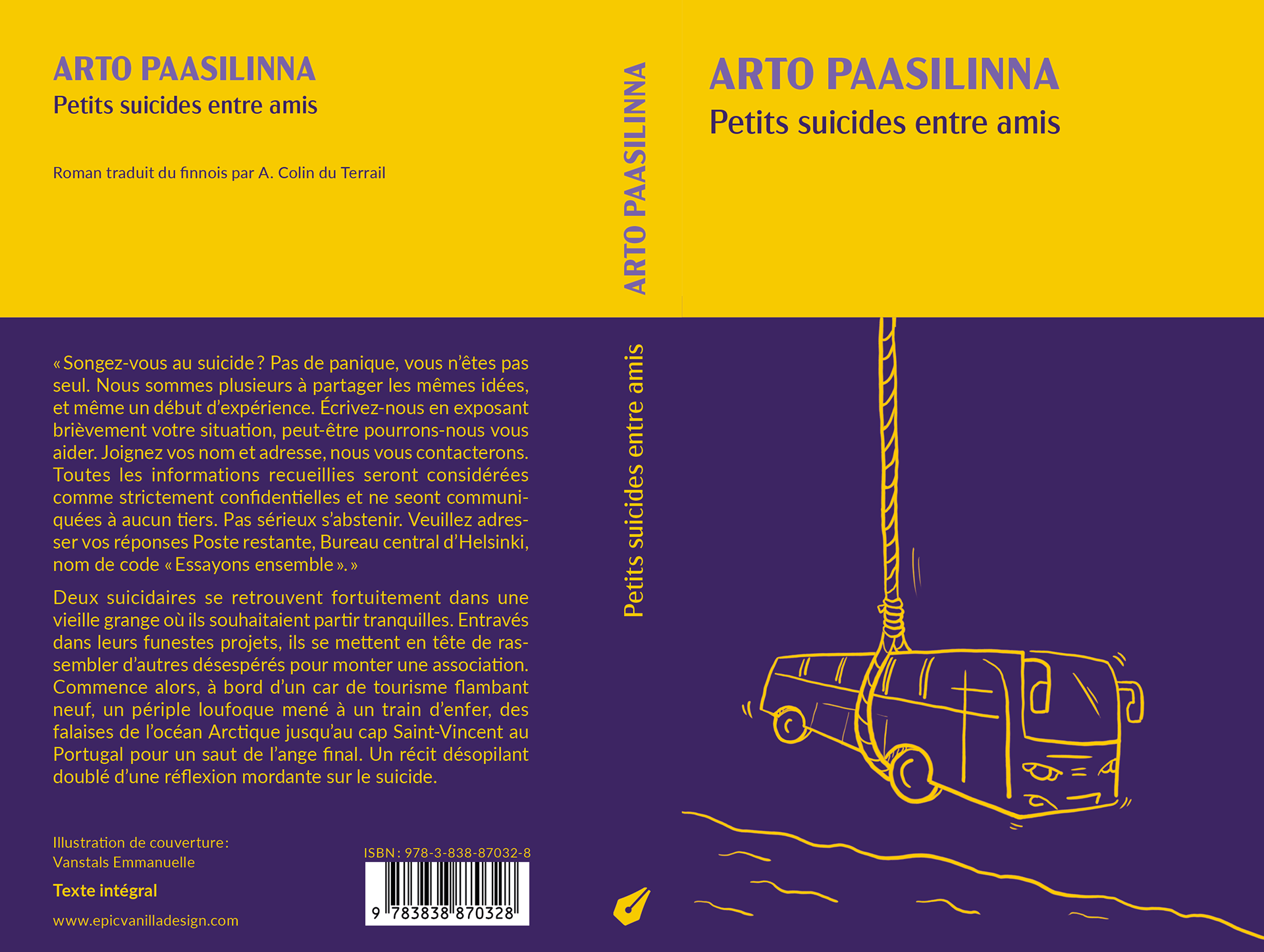
For this project, I chose a bi-coloured background that allowed me to play with the contrasts. I used the fonts “Acme Gothic” for the titles and author's name, and “Lato” for body copy. The illustrations are created in the spirit of a sketch, inspired by the novels themselves.
Thanks for watching!
