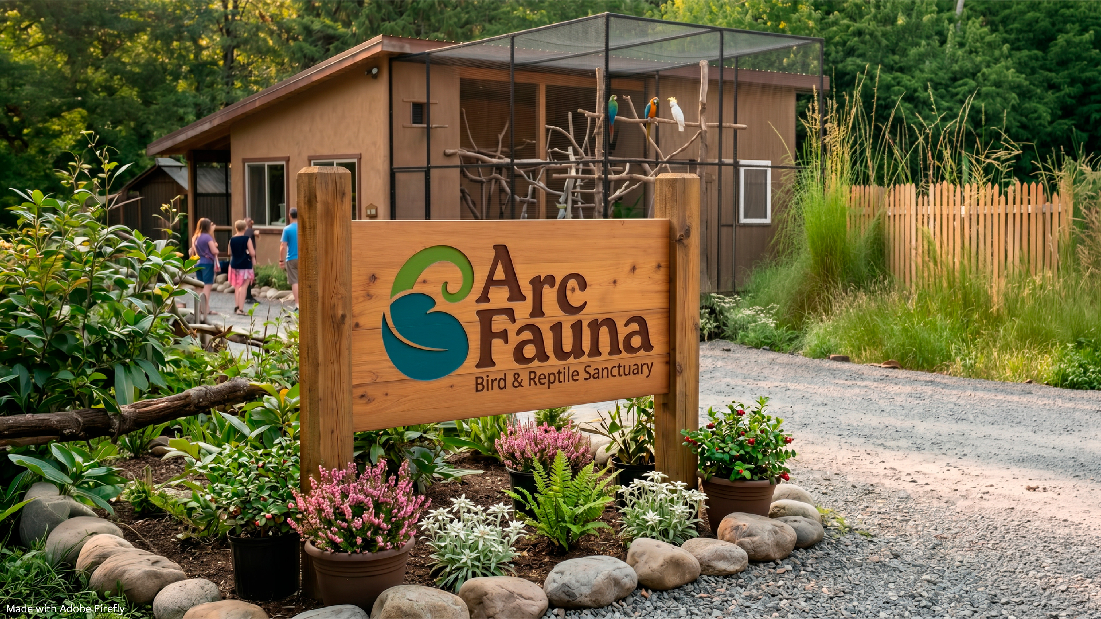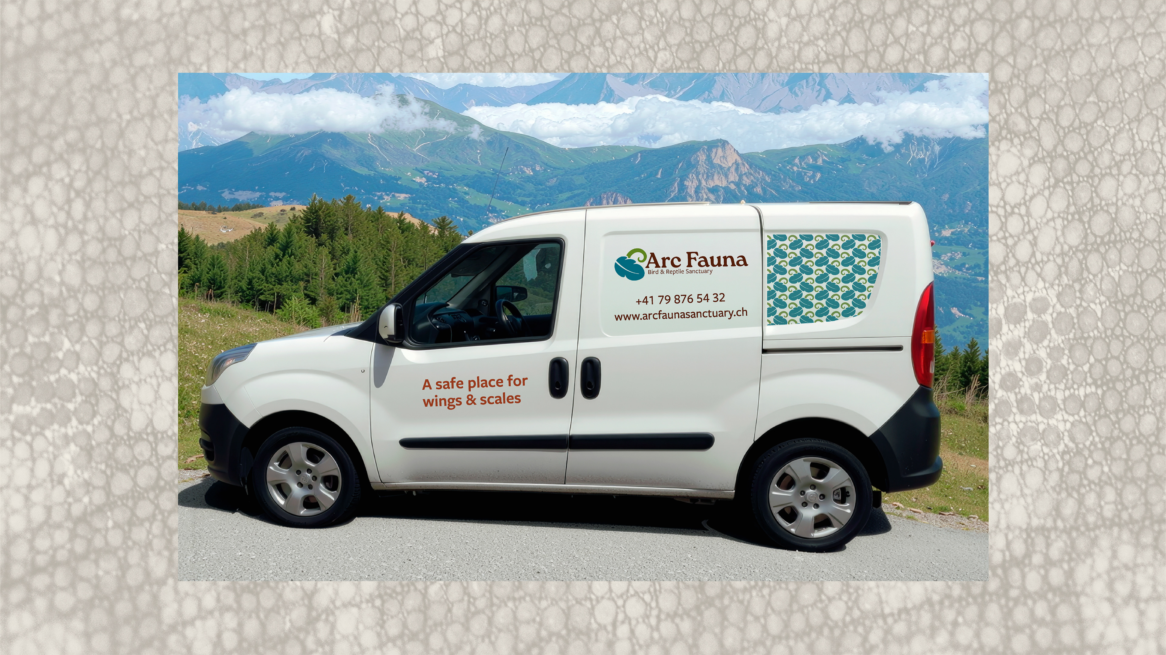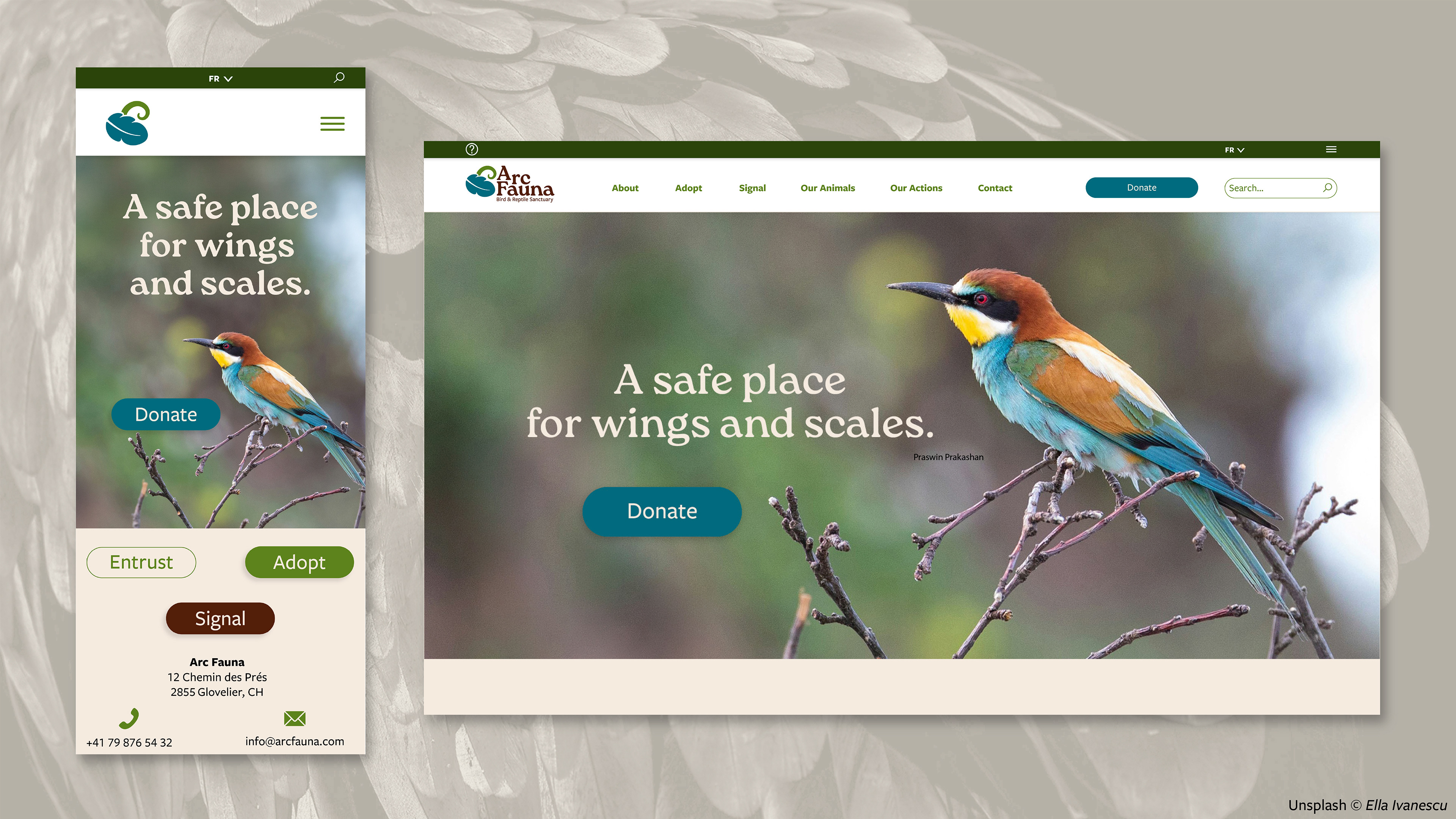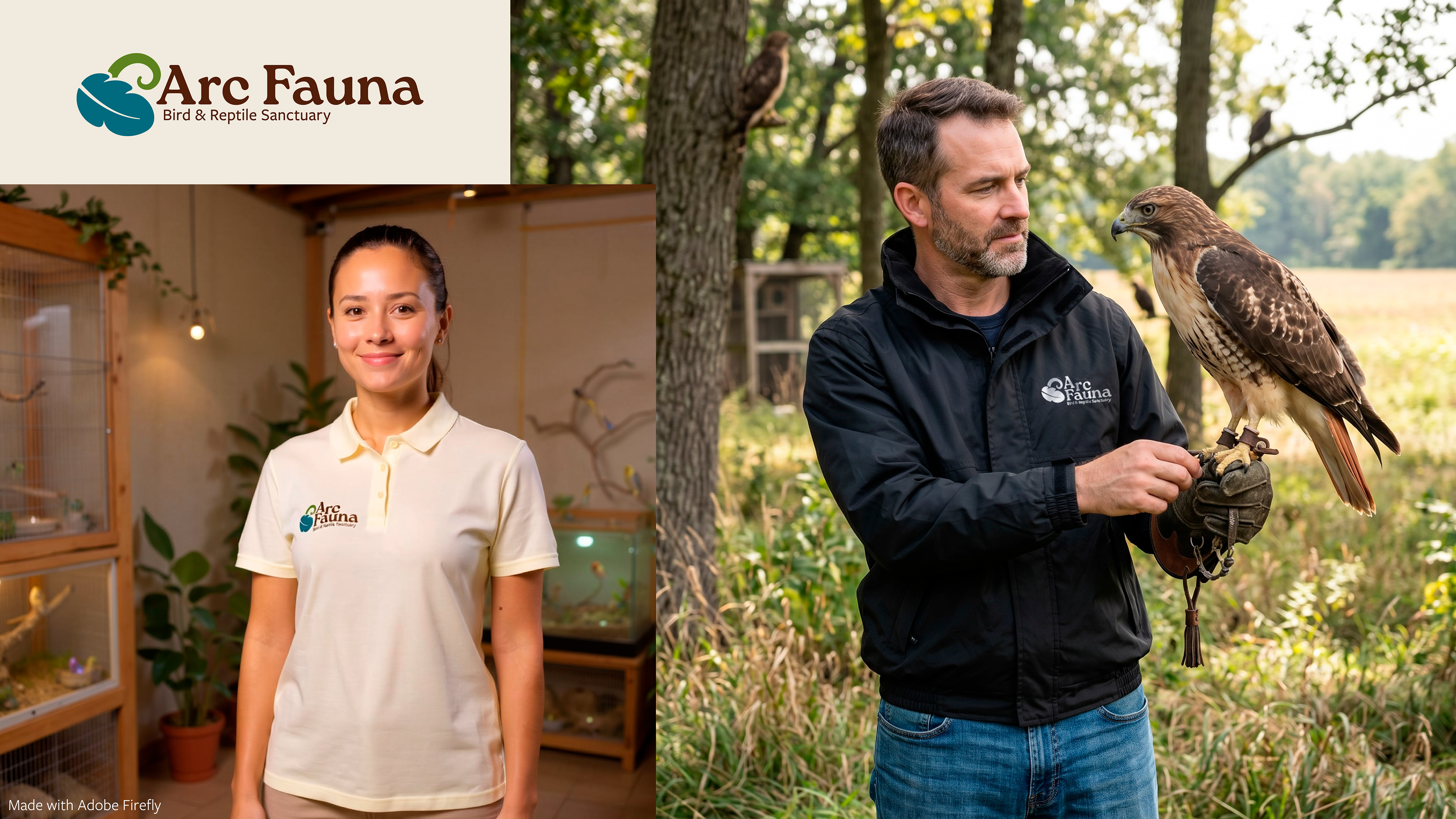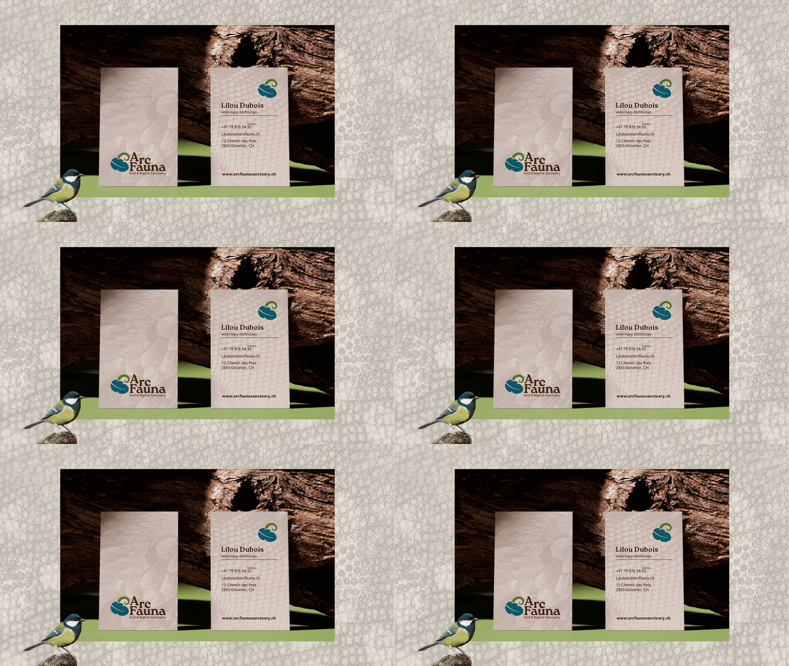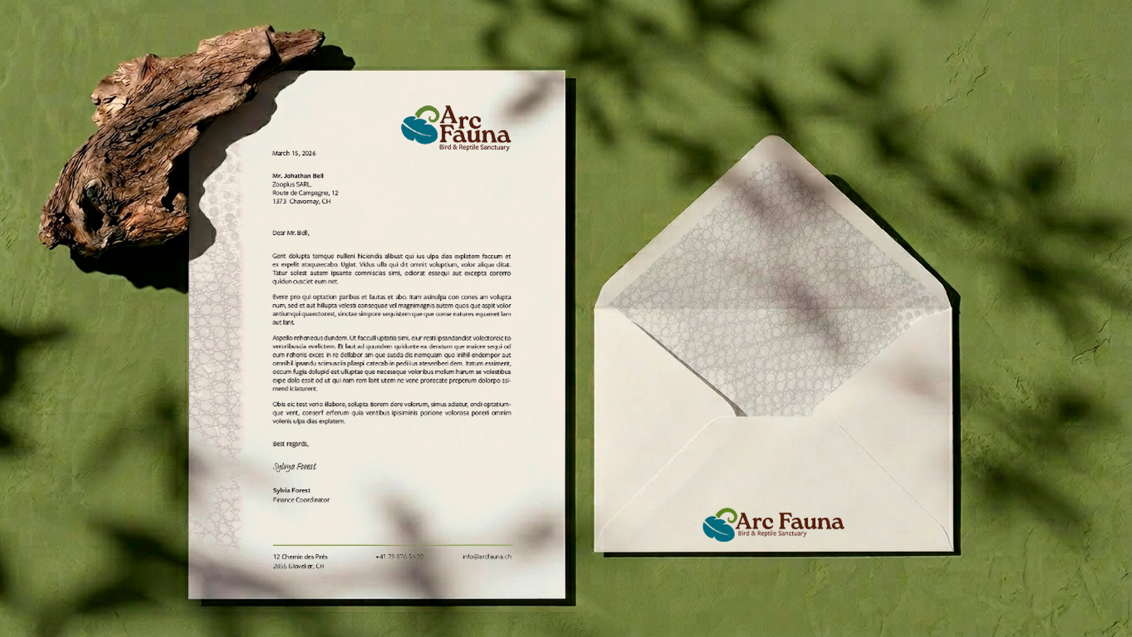
brief: Design a logo and branding system with real life applications for a non-profit rescue and rehabilitation center based in Switzerland. The center specialises in birds and reptiles.
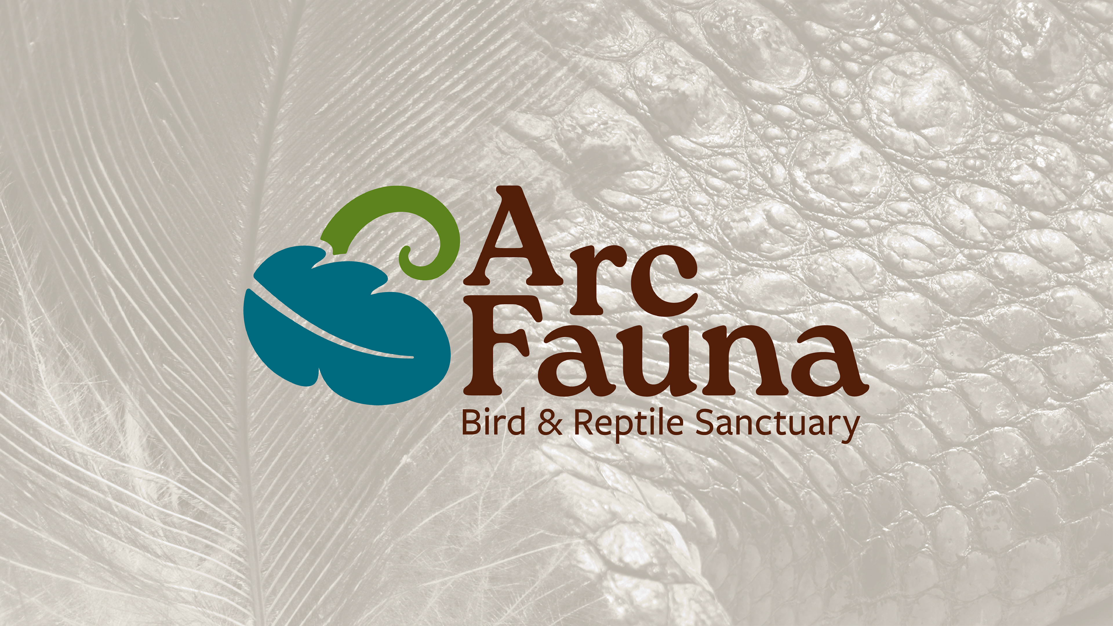
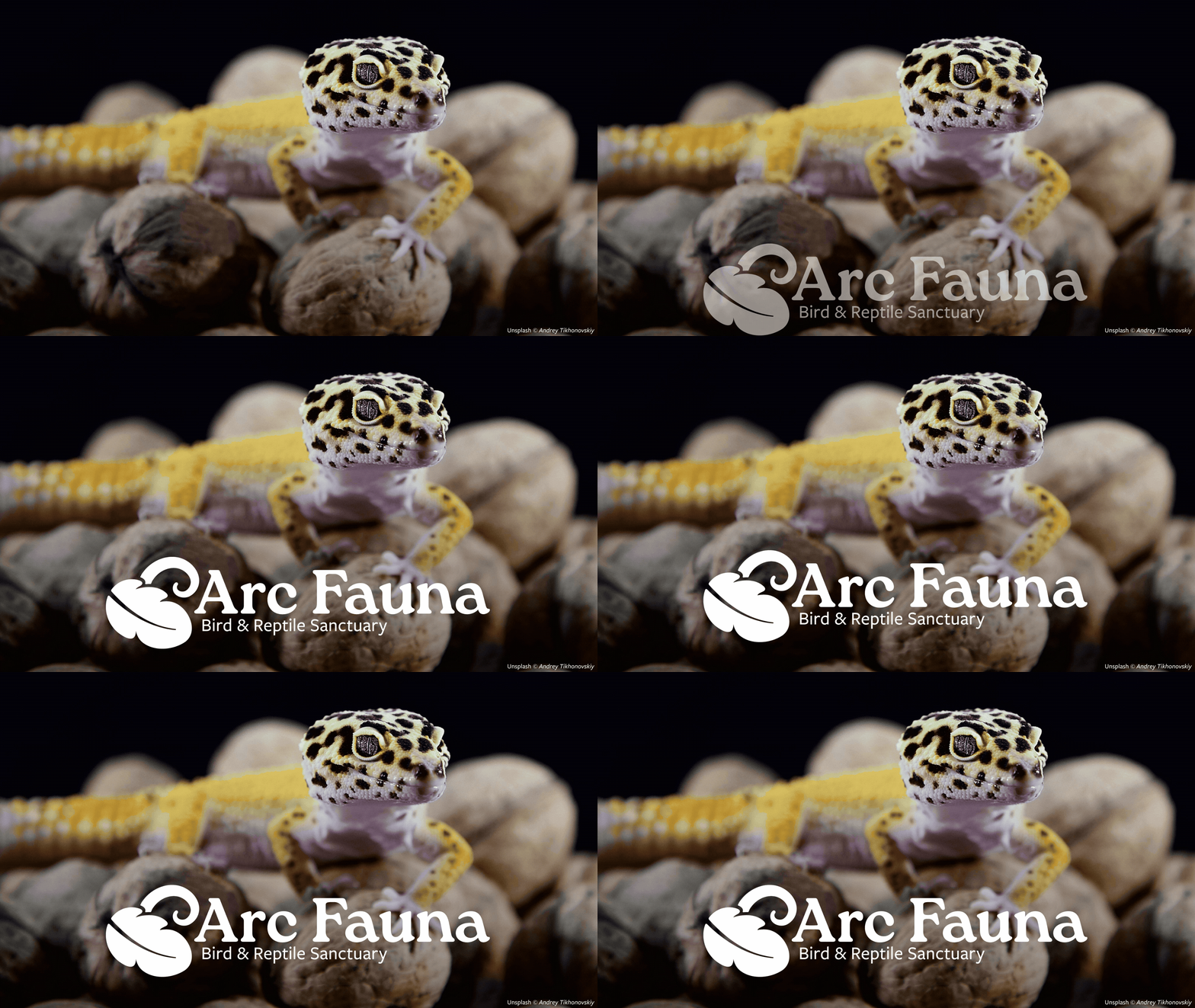
challenge: Create a logo with a symbol + wordmark and decline it for a full branding system, easily usable by non-designers. The logo should be scalable, recognisable in monochrome and the overall identity must age well within a 10-15 year range. Finally, the symbol should feel protective and generate empathy, not drama.
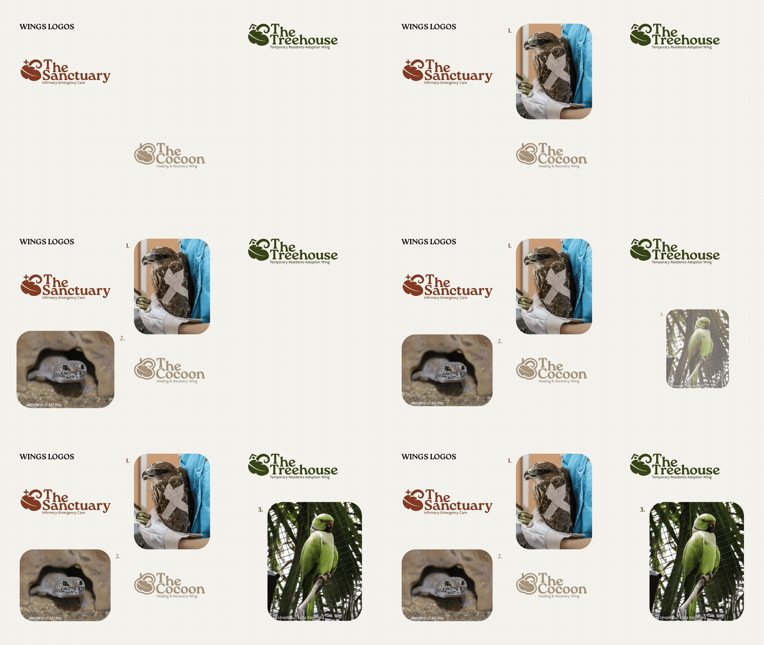
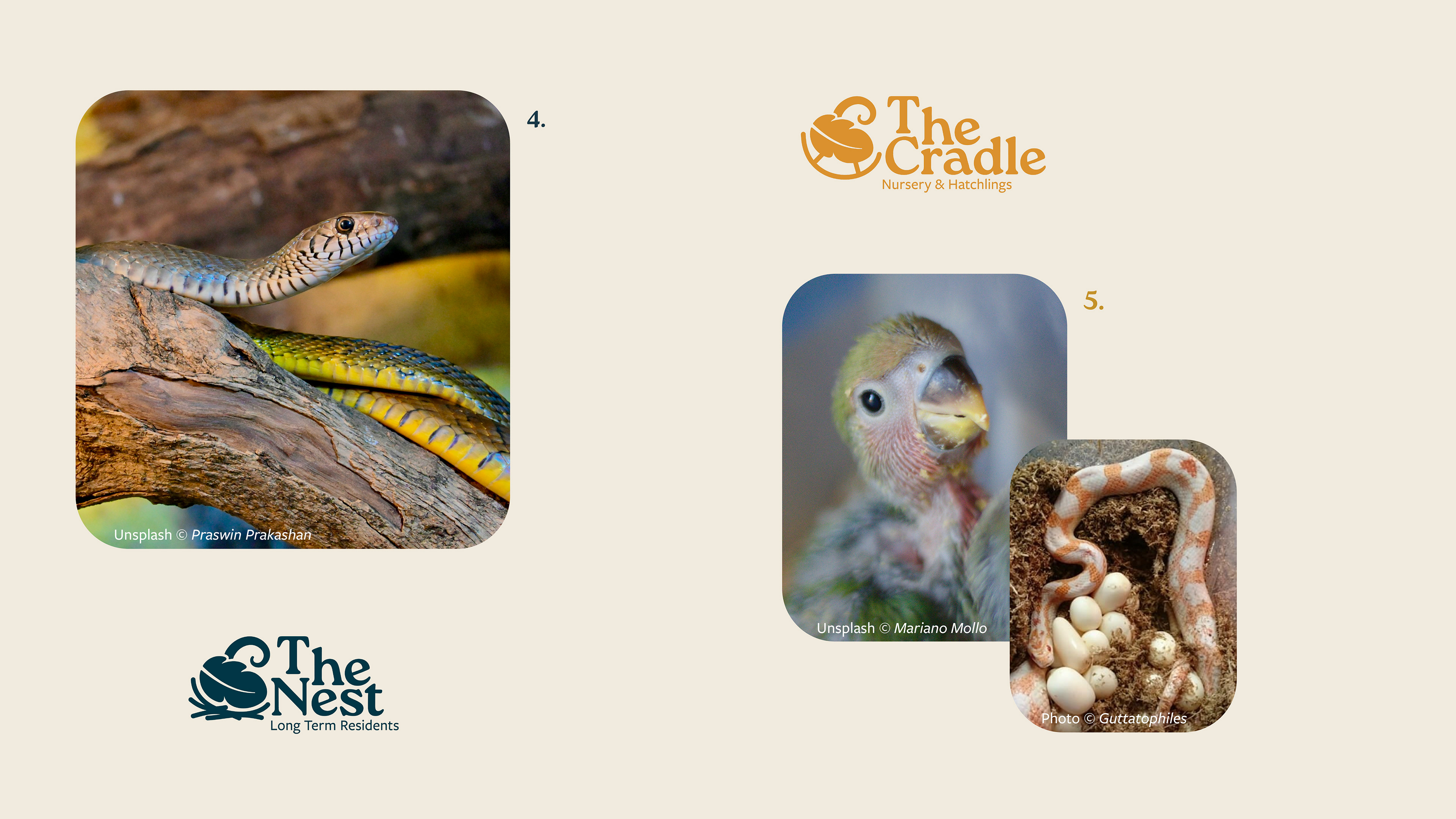
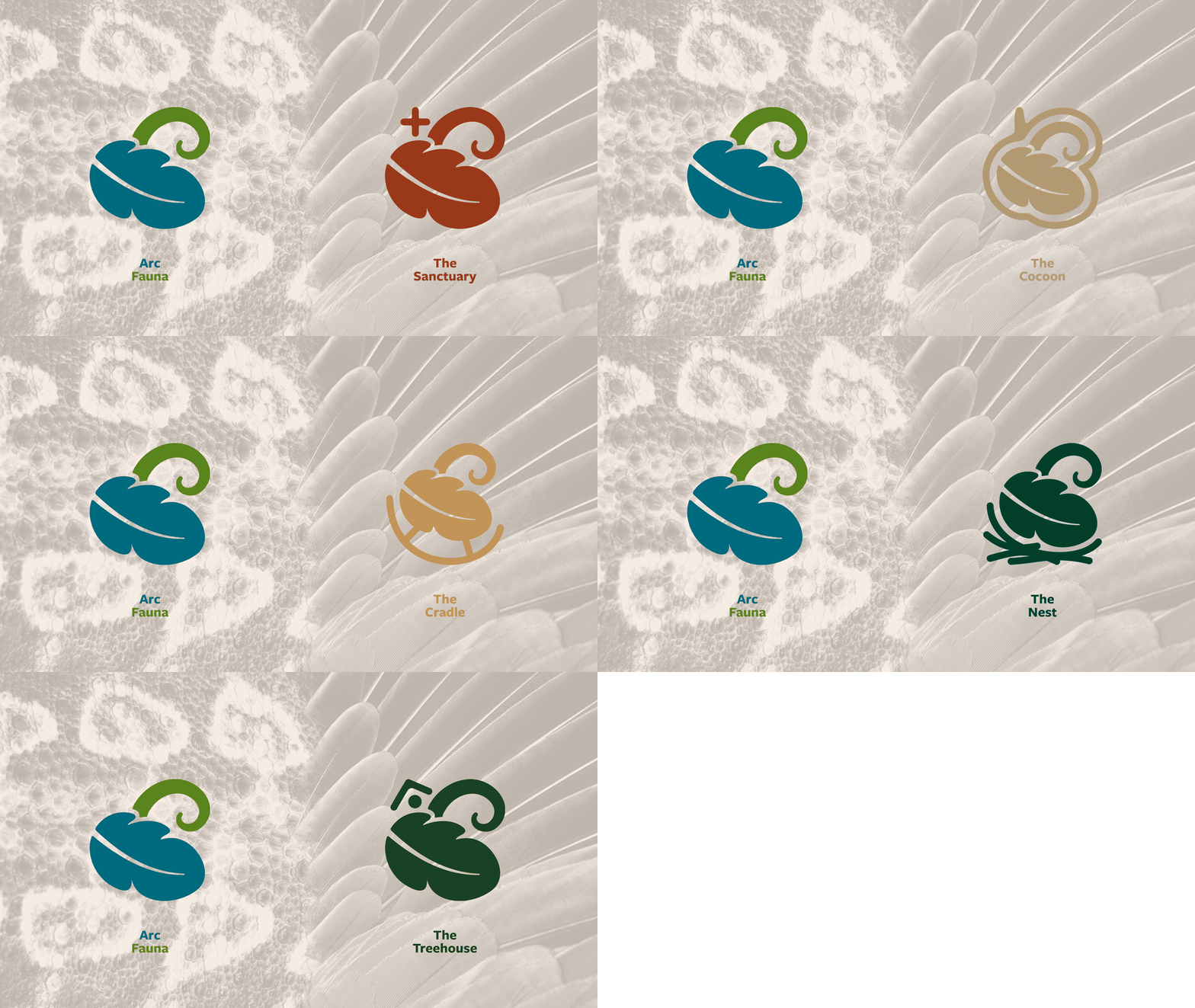
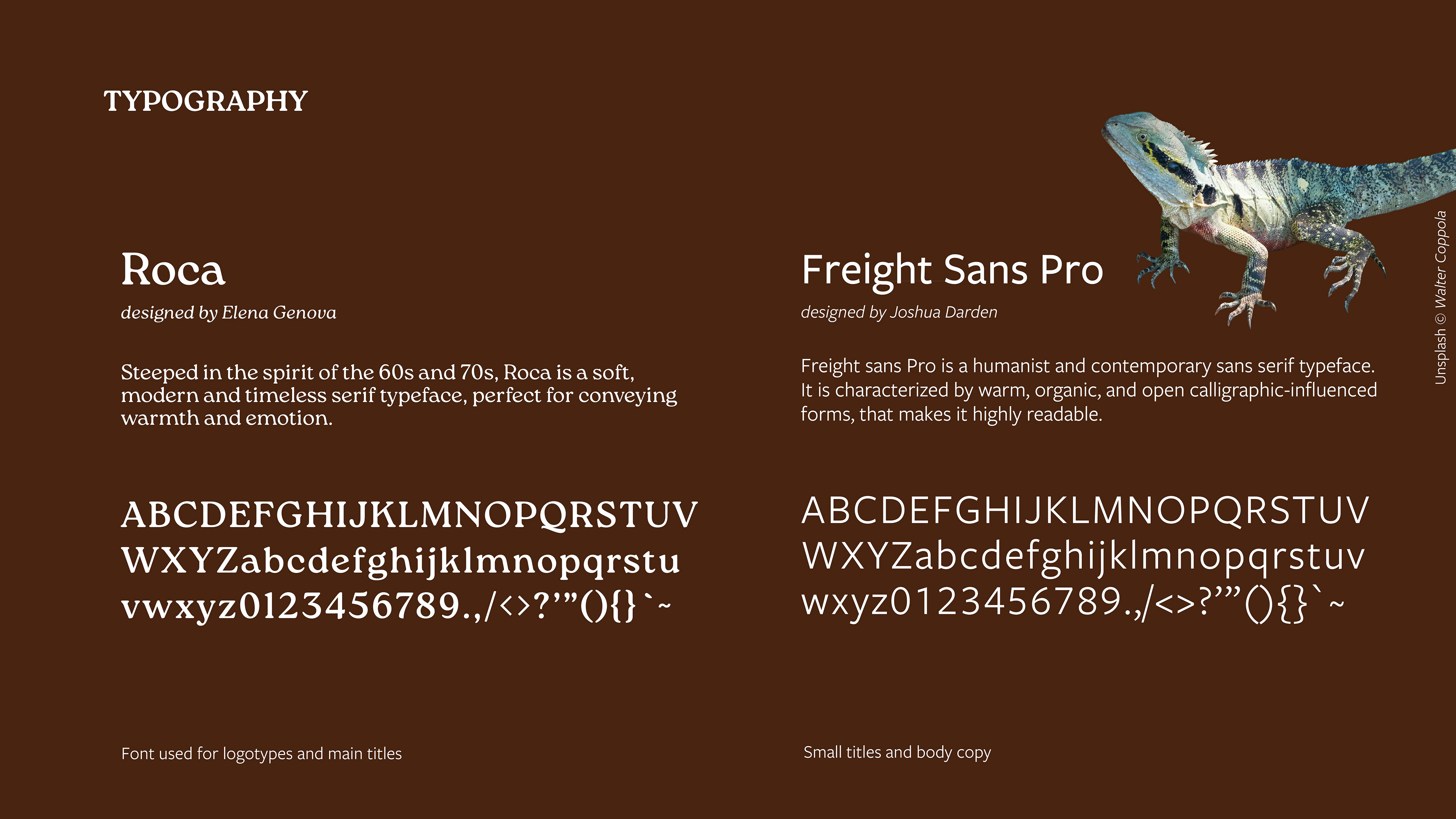
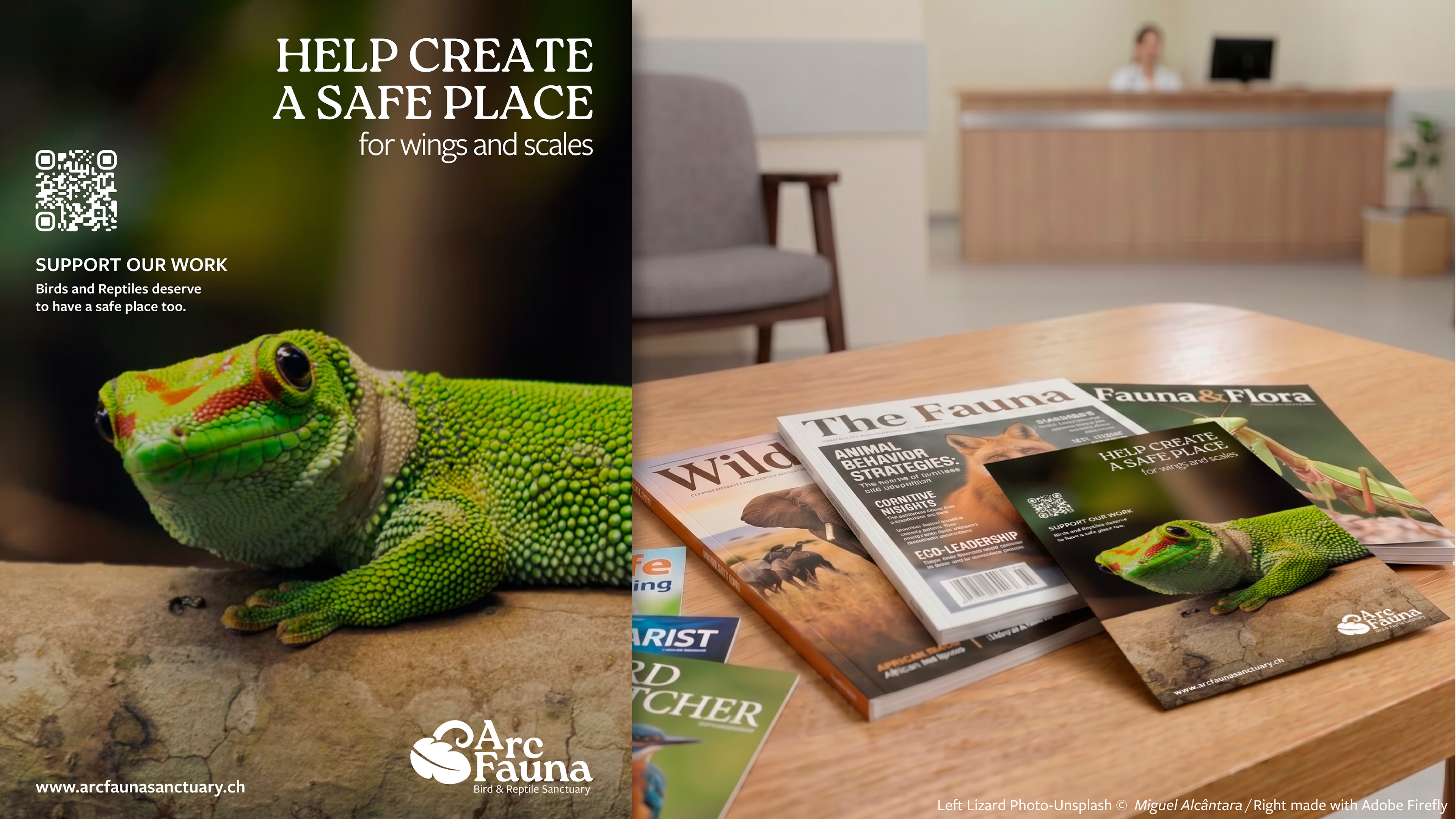
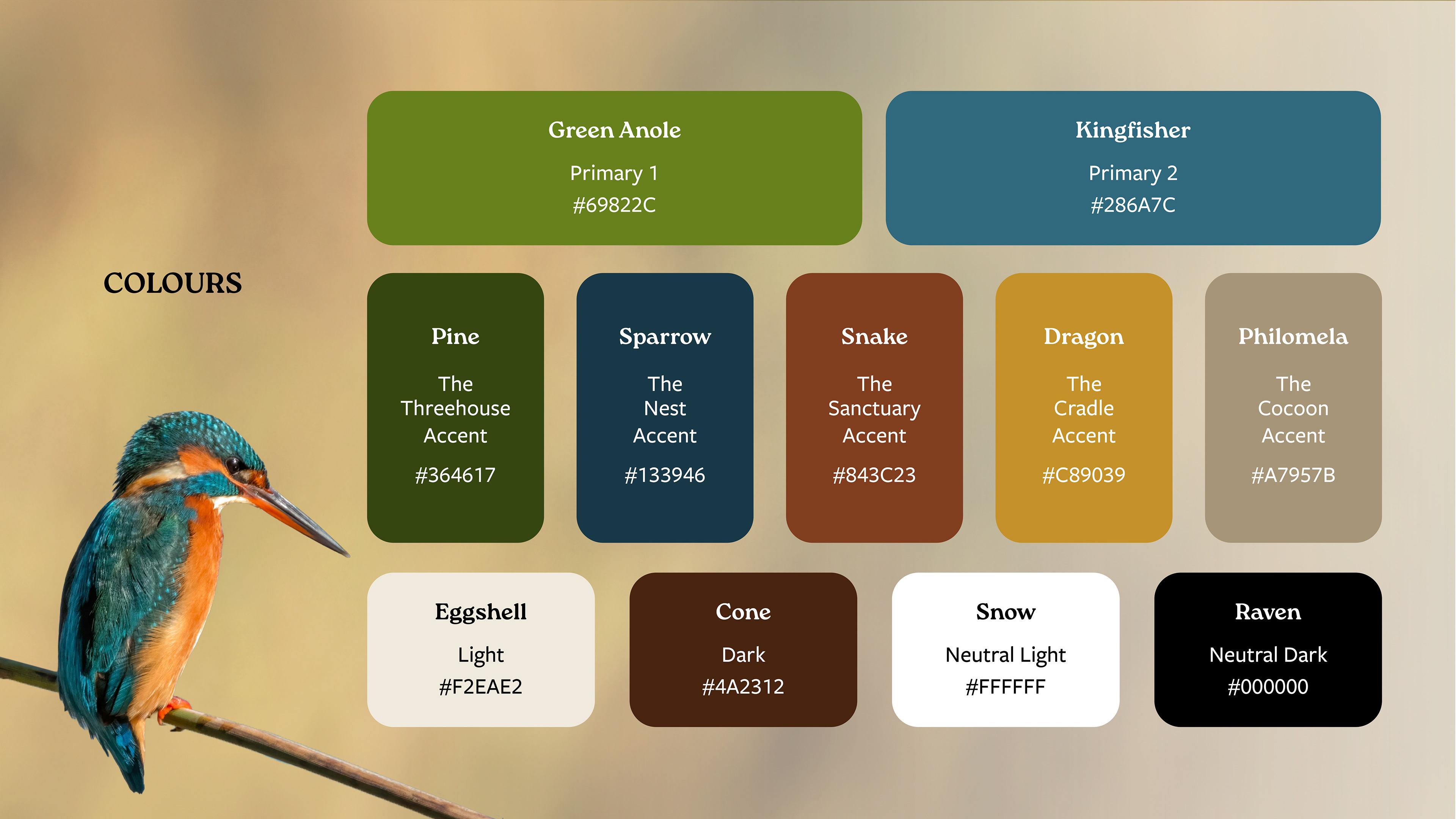
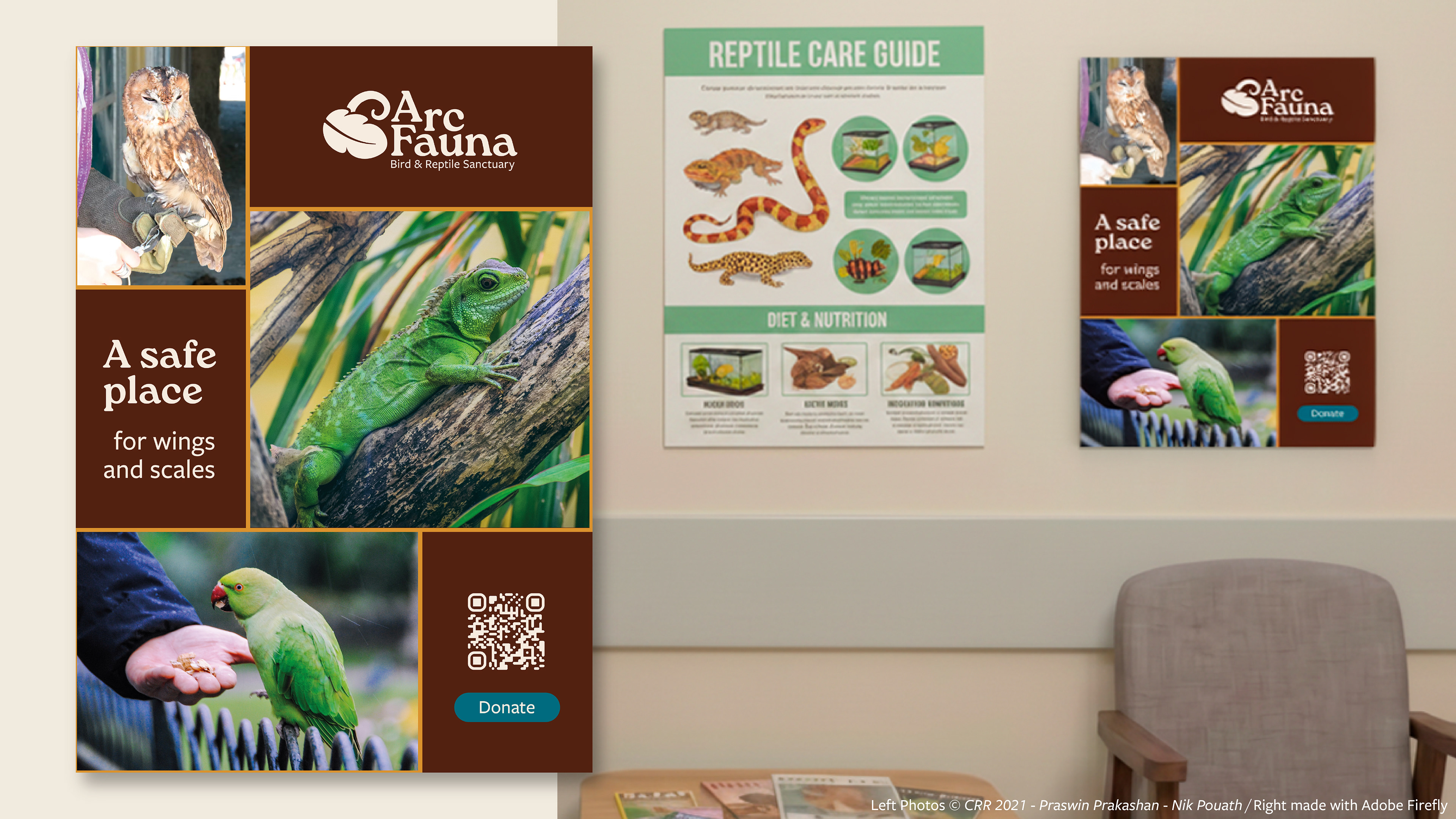
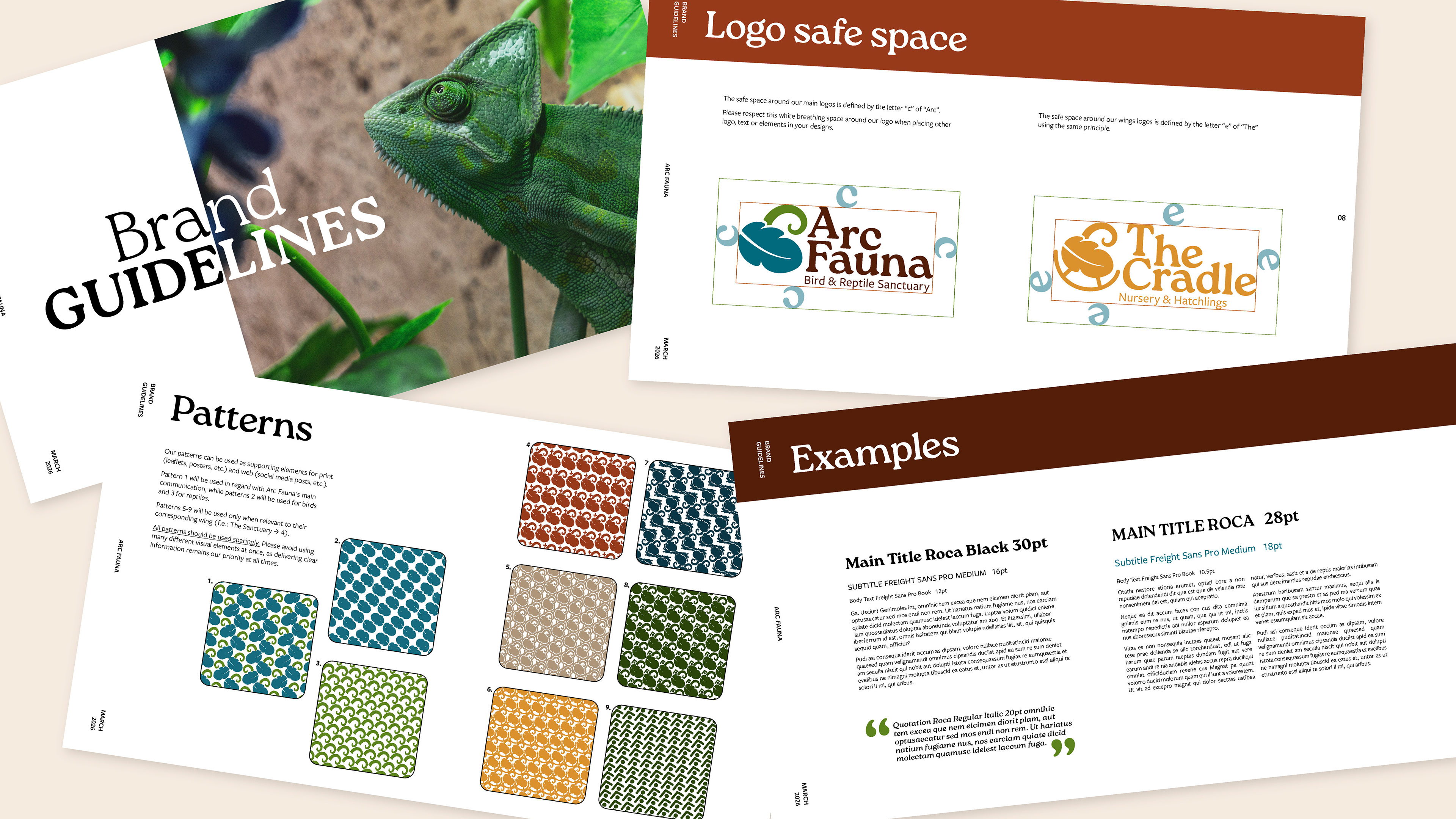
approach: I started this project by working on the symbol. The second step was to find the perfect fonts to complement this symbol. A distinctive font for the wordmark, to be also used for titles in documents, a second ,more discreet font for the tagline, to be also used for text in other documents. After the main logo, I created secondary logo declinations for the various wings, and finished by creating a brand guideline booklet as well as various real life examples of usages with mockups.